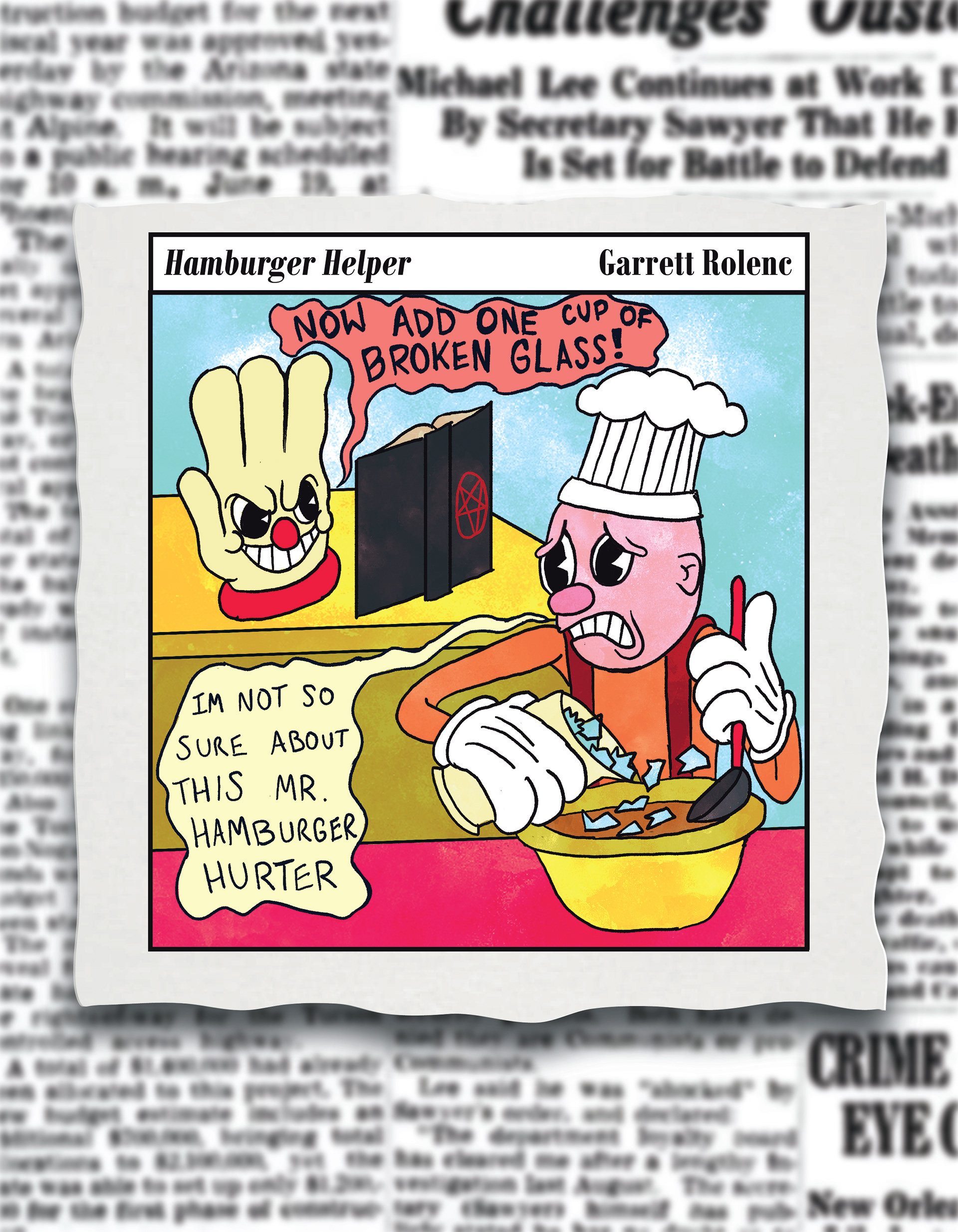
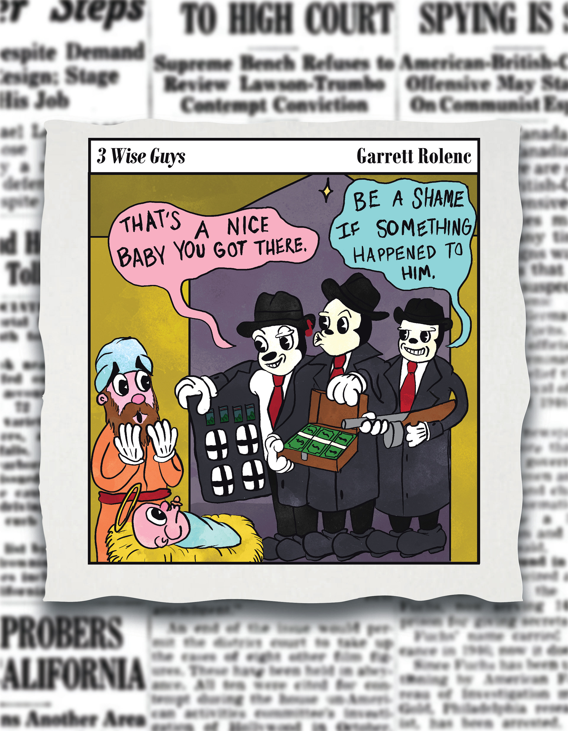
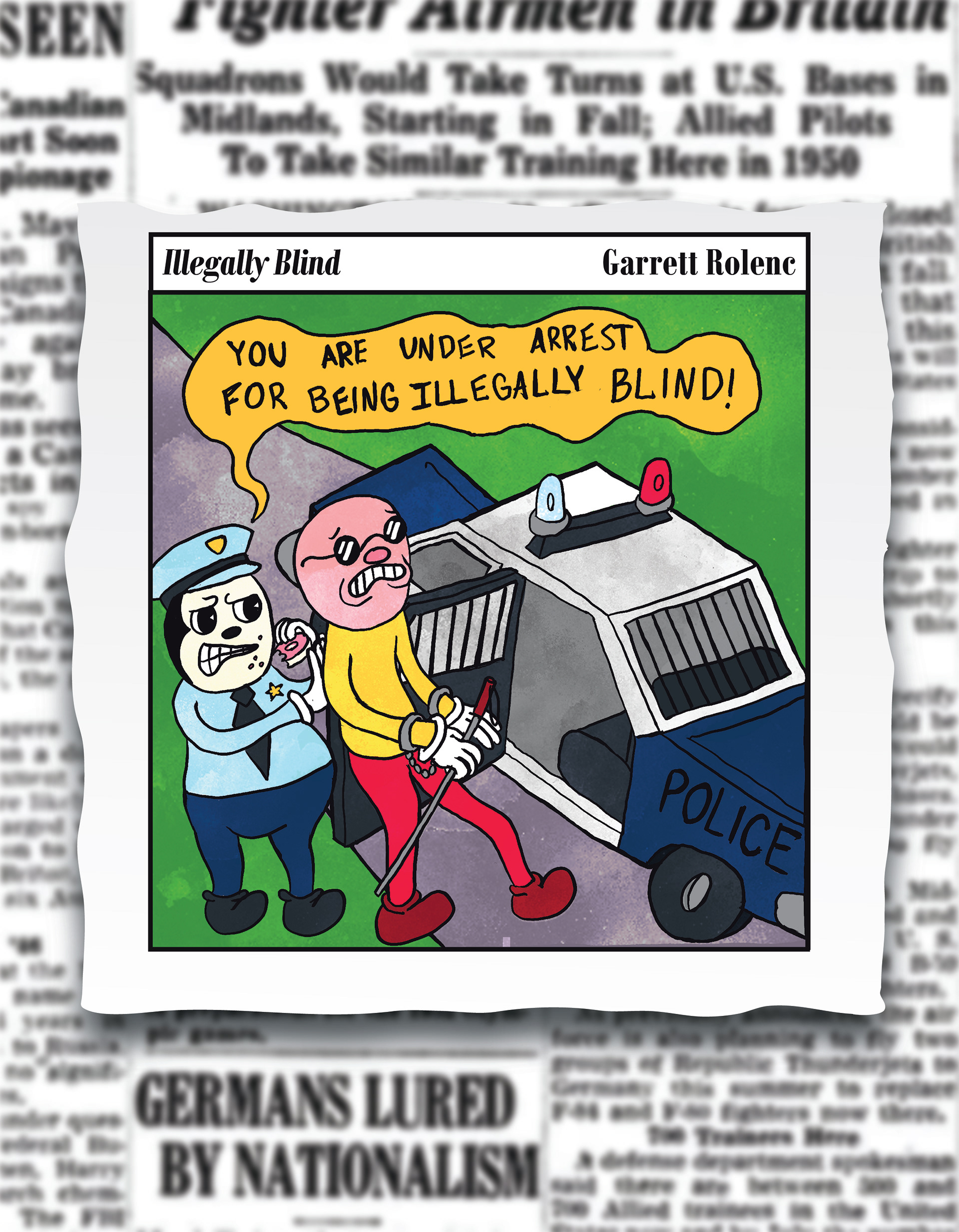
I originally thought about doing something music or movie inspired for this project, but ultimately didn’t like what I had come up with. Whenever I have trouble coming up with an idea for a project, I consult a list that I constantly add ideas to. Most of the time the ideas on the list are bad or impractical, and so they sit there, unused. For this project, I thought it might be fun to revitalize these bad ideas into a comic style poster series, hence the name “Bottom of the Barrel”. Most of the ideas are sort of puns, so I created a scenario where the punchline of each comic would sort of be the pun that I had originally written down. I looked at a lot of references to try and figure out what style of comic I should do, and ultimately thought that it might be interesting if I stepped out of my comfort zone a bit and tried a style I wasn’t that familiar with. I ultimately decided on trying to mimic a 1930’s rubber hose cartoon style. Because of this, a lot of the shapes and colors are fairly basic and simple looking, so to help make the overall design more interesting I added a watercolor texture overlay to create a bit of diversity throughout each piece and to also unify them a bit more. For the background of each piece, I thought it might be interesting to have each of the comics sort of hovering over a newspaper backdrop. This helps to not only add a lot of contrast, naturally drawing the viewers eye to the comic, but also creates a setting and aesthetic that helps the viewer have a better understanding that this comic was designed to be in a newspaper. I enjoyed the whole process of designing characters and trying the arrange them in a way that flowed the best and created the most visual interest and working in a different style than what I am used to.


